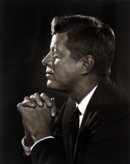
Looking at Yousuf Karshs JFK.
One very important step that must be taken when creating a pastiche, especially one that was taken in a controlled lighting scenario, is to figure out the lighting set-up. This is possible by looking at what areas of the picture are light, especially around the face. It is also possible, if the model is looking at the camera, to be able to tell what lighting is being used by looking at the reflection in the eyes.
One blog, which has looked entirely on guessing the lighting of set-up model shoots, which includes advertisements can be found here - http://guessthelighting.com/?04171e60. It shows, in great detail, various studio layouts, and I found it quite helpful when attempting to guess the lighting used in the JFK portrait. It's also full of useful tips for using controlled artificial lighting.
My very rough sketch of how I think the light's might have been set-up in the original image.
This is only a rough idea, it will be interesting to see how this set-up will look when in use in the studio. There is defiantly a light shining onto the front of his face, from the image, it looks as if the light is shinning down onto his face, and this is where JFK is looking. It seems like quite a bright light. There is also a light shining behind him, onto the back of his head. It also looks like there might be a light shining onto the side of his face, in the direction that the camera is pointing, simply because there is so much detail visible.
Photographs - Take One
After I was certain that I wanted to do a pastiche of Yousuf Karsh's portrait of John F. Kennedy, I decided to book out the studio, and speak to a few of my friends who might have been interested in being my model. My friend Joshua agreed, who was fortunately a law student with a variety of suits suitable for the occasion.
My very first attempt at using the studio and creating a pastiche went relatively well. I decided to use the umbrella lights to give a softer lighting, as I thought the use of the flash would be too harsh. While looking through the images there were defiantly one or two that I would have been able to work on.
As I began to work on one of the photographs from the shoot, I noticed something relatively odd, The majority of the photographs were very very grainy. When I looked at the settings of the camera to find out what had happened, I noticed that the ISO was set to very high number. Knowing this, I decided to retry my photo shoot, but to remember to use a relatively lower ISO.
My second photo shoot went a whole lot better. I already knew how to set-up the lighting so I knew what I was doing, and I was able to take a larger variety of photographs changing the power of the lighting and the setting of the cameras.
I really enjoyed my time working in the studio.
There were definitely a lot more photographs in the second shoot, compared to the first shoot, that I could use as my final image. They did appear to be quite dark, but as I shot in RAW format, it was possible to put the light back into the image.
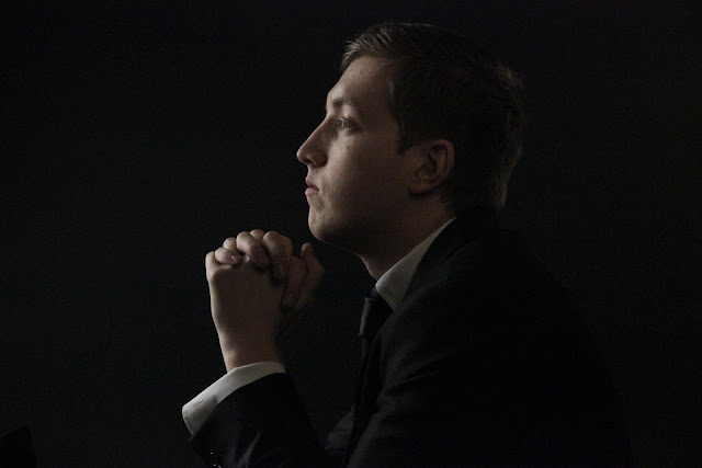
Here is the JPEG version of the photograph I have decided to use as my final image for the Pastiche. I decided to choose this one mainly because of the light in the eyes, which appears quite similar in the original photograph. It does appear quite dark here, but using the RAW version I can work specific lights into the image, and edit in great detail.
When opening the photograph in Photoshop, it opens a window which gives you the basic editing options to use on a RAW photograph to correct it. I didn't change anything too drastically, I simple increased the exposure and brightness to make it clearer. Added some fill light, which I probably should have avoided, and increased the clarity.
To begin, I cropped the image to be similar to the original, which involved getting rid of some black space on the sides. I also used spot heal, to remove any very obvious blemishes, simple because JFK does not appear to have any spots on his face, even though the image is very very clear.
I then adjusted the photograph to be black and white but added a yellow/orange tint, to give it that sepia look like the original.
I finally selected the are of the colar and the rest of the white shirt appearing through the suit jacket, and brightened only them selected areas. They seem much brighter in the original image, compared to the rest. I also dodged the area around the front of his face, hair and also around the back of his hair.

I am very happy with my final image, it looks very similar to the original. I would have, if given the chance, experimented and been much braver when working in the studio. I felt that the way I edited the image worked quite well, especially when it came to brightening the collar.


No comments:
Post a Comment