Monday 30 April 2012

Book Cover - Page 2.

Photographs.
I decided to photograph a small bottle with the words 'Frobscottle' written down the side in amongst rocks. the rocks were meant to highlight the fact that the story is based inside the BFG's cave. What was difficult about these photographs was not having my reflection in the bottle.
Here is the original photograph of my final image that I wish to use. There is no reflection in the bottle which I was very pleased with. For the final image I will have to :
  • Add some color to make it more attractive to the audience
  • Add text
  • Maybe make the frobscottle writing more obvious
  • More detail


here is my first attempt at the image. There is a lot of space around the bottom, so I am going to add 'Roald Dahl' along here.


Still Life - Page 2.

Lighting Set-up
Here is the lighting set-up which I have decided to use. the contact sheets show the variation of powers I decided to use to light up the object.


Attempting Photographs - 2.
To begin I photographed flowers, which I had purchased from the market against a white background.
They turned out fairly succesful, but I found it very difficult to get the background white. I also felt that using the white background wasn't very appropriate for photographing a very yellow, almost white, flower, although the greens of the stem came out very nice with the colours.


Attempting Photographs - 3.
Here is the contact sheet for the black background I used to photograph behind the flowers. The black background came out much better than the white. It really makes the colours of the flower head stand out beautifully.


Here is the photograph I wanted to use as my final image. The contrast and tone has been changed slightly to make the colours stand out even more, but that's all. The reason why I didn't use this photograph is because the narrowness of the image makes the flower look very close and compact, more space around the flower is needed.


Here is the image I have decided to use as my final image. I am very fond of the focal length in this particular image.

  • The image does need to be cropped though, perhaps into a square.


Here is my final image, cropped into more of a square image. The contrast and tone was edited as well for this final image. 
Overall I am very happy and very fond of this photograph. The detail is very nice and I do like how it has a Georgia O'keeffe feel to it.

Still Life- Page 1.

Still Life: Art History Theme

You will research and produce a still life that is inspired by someone or something in the history of art. It could be an artist, image, sculpture, film or performance. The work can have a fine art or commercial approach.


I know instantly that I will want my photograph to have a fine art approach, simply because I enjoy still life much more that any commercial approach.
For this still life brief, I would like to work in the studio, simple to increase my experience of working in it and make myself more familiar with controlling lights.


Make your own.
To begin, I decided to experiment and I decided to create my very own miniature photographic studio by using a desk lamp and black card. I folded the black card in half in order to use it as the background and bottom underneath an object.


I photographed peppers mostly, to attempt to recreate Edward Weston's photograph of the pepper. I also photographed a small clock which I kept at the end of a chain. It was fun to mess around with lights and change camera settings, but I want to work in the studio.


Research.
I am quite fond of flowers and nature, so I wouldn't mind taking some photographs of flowers against a dark background, to highlight their vibrant and colour.


Georgia O'keeffee
My main influence in my still photograph will be Georgia O'keeffe, an artist which I have studied in A-levels, a very talented painter who painted a vast variation of flowers over her career. Interesting two of the photographers which I looked at for my pastiche, photographed Georgia O'keeffe. 
O'keeffes painting always look very delicate, which I aim to outline in my final photograph. It also has bold colour background which might be something to consider.
She is an inspiration to art because she was known around the world as a great painter and artist

Book Cover - Page 1.


"BBC Cover: BBC Big 100 Read
Produce a cover for one of the top 100 BBC big read books typography and how it is integrated with the image should be explored."

I really like this brief's title, it seems very different and interesting and I look forward to doing it. One problem I do have though is the fact that I haven't read many books over the years, and not many of the ones I read are avtually on the Big Read. I am fairly familiar with the children's books shown on the big read such as : Alice in Wonderland, Treasure Island, Matilda and other Roald Dahl books.

The BFG.
Out of all of the books I have decided to look at The BFG, a very familiar Roald Dahl book that I know very well. 
I also own the book, so I have decided to take phrases and words out of the book which I might find useful.
  • The Witching Hour
  • The Cave
  • The Marvellous Ears
  • Black Cloak, Large Suitcase
  • Frobscottle and Whizzpoppers

Frobscottle is one that stands out to me. I always remember pretending to drink Frobscottle when I was younger, so I am very drawn to doing something with that.


Research - Brian McArty
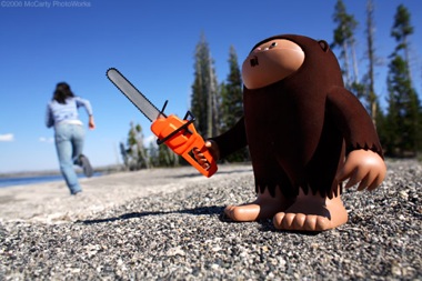
One photographer who's work I am interested in looking at for this brief is that of Brian McArty, a toy photographer.


“Memphis-born toy photographer and director/producer. Working with toys for over 15 years, McCarty’s unique and innovative vision has attracted a huge international following. His postmodern integration of concept and character has earned McCarty’s photography a prominent position in the so-called "Art-Toy" movement.”


The reason why I have decided to use Brian's work is because the way he uses small objects and makes them appear very large, which I think I'll find useful in my final image because of the size of the BFG.


Environmental Portrait - Page 2.

Photographing - Attempt 1.
For my first attempt at an Environmental Portrait, I took a photograph of my grandfather who is currently living with me and my family, due to ill health. 
He sleeps the majority of the day, so it was difficult to take a photograph of him while he wasn't asleep. I did want to use my grandfather for my Environmental Portrait, but a few days after this photograph was taken, he was taken into hospital, so it would have been very difficult to photograph him.


Photographing - Attempt 2.
My first attempt of an environmental portrait consisted of photographing my 12 year-old sister in her bedroom. at that age, I felt that her room was the most appropriate place to have her situated. Her room is also pink and purple, which I felt highlighted the fact that she was very young. It's full of toys, but it's also full of electronic gadgets which I found highlighted our modern world that she has been raised in.

Some of the images did come out quite well, but I wasn't 100% sure about it. The photographs did come out very dark as well, considering I was using portable studio lights.


Photographing - Attempt 3.
For my second attempt, I photographed my boss, David, who is a chef in Eddy's restaurant on the Gower.
I really enjoyed photographing in the kitchen, the lights from the counter and behind gave a very nice controlled lighting look, even though it did give everything quite a yellow glow. I began by photographing David, attempting to catch him busy at work, so he wasn't looking at the camera in a number of the photographs.


This was one of the images I wanted to use as my final piece, it was taken at a relatively fast shutter speed but at the same time it captured the movement of David busy at work. It's quite dark for a final image. He isn't looking directly at the camera, and after close consideration I decided to go back and photograph David looking at the camera.


 For the last few photographs I got him to look at the camera, and as soon as he realised he was having his photograph taken, he began posing and all sorts, so I had to choose an image which wasn't too comical.
Here is my final image, in JPEG format, unedited. I am quite fond of this photographing. Knowing David quite well, it was nice to see him unstressed and rather relaxed. I think that the surrounding metal gave a nice sense of how hard his work is, in a strange way.


I didn't edit the final image too much. I like the warm glow of kitchen, I felt it highlighted the heat of all of the cooking equipment.


I tone done the warmness of the image slightly, and I bumped up the contrast and tone. I am fairly fond of the way the lights shine directly onto David, it gives him a nice almost glow. 
Perhaps I should have cropped the image a little, or maybe taking the photograph at a lower angle, but overall I am relatively happy with this photograph.

Environmental Portrait - Page 1.


"You will photograph someone in a place that is relevant to that person; it could convey something about their personality or employment. This could be a person of authority, someone who means a lot to you or someone you just find interesting.

This brief focuses on using controlled lighting outside of the studio; this could be flash, constant light, techniques such as light painting or carefully reflected ambient light."


Some ideas of who you could photograph.
  • My sister in her bedroom (12 year-old girl)
  • My Dad in his garden
  • My brother in the gym.
  • My boss, in a kitchen (chef)
  • My grandfather

My main ideas which I had, when I began looking at the question included photographing my family members or even my boss in the work place. My favourite ones out of these five are ; My sister in her bedroom; My grandfather in his room; or I could photograph my boss, who is a chef in a large cafe.


Research
Surprisingly there are a number of photographers who photograph people in their own environment, which I was not aware of. 


August Sander
Sander is known for his environmental portraits, which are historic in the world of photography.


"He gave a controlled and intentional hint at the origin and profession of the sitter through the background or through clothes, hairstyle and gesture."


They are classic photographs which have a very vague essence of the environment of the person being photographed. Sander's work is a reinsurance that an environmental portrait does not have to be obvious.  I chose to look at Sanders work because he is a classic example, and is defiantly a photographer which is worth looking at. He is, in my opinion, more of a documentary photographer nowadays, keeping a record of the way of 'man.' Which could be an interesting aspect which should be considered when capturing your work.


Arnold Newman


Arnold Newman is another very well know Environmental photographer. Most of his work shows a person, mainly artists, with an object that represents what they do. such as the example above, which is a portrait of Igor Stravinsky, a pianist from the year 1946. Newman, who's work is similar to that of Sander's, shows very simply their subjects environment.
"Newman found his vision in the empathy he felt for artists and their work. Although he photographed many personalities — Marlene Dietrich,John F. KennedyHarry S. TrumanPiet MondrianPablo PicassoArthur MillerMarilyn MonroeRonald ReaganMickey Mantle, andAudrey Hepburn he maintained that even if the subject is not known, or is already forgotten, the photograph itself must still excite and interest the viewer."


Mary Ellen Mark


A lesser known environmental photographer, who's work I found very interesting, was that of Mary Ellen Mark.

Mary Ellen Mark is a fairly more modern environmental photographer, with an old fashioned approach. She is photojournalist who's work does appear as an accidental environmental shot. They are photographers of people in their own environment, simply enough. Out of all three of the photographers I feel that Mary Ellen Mark's is my favourite, with her accidental approach, it is simple but very effective. 


Pastiche - Page 3.


Looking at Yousuf Karshs JFK.


One very important step that must be taken when creating a pastiche, especially one that was taken in a controlled lighting scenario, is to figure out the lighting set-up. This is possible by looking at what areas of the picture are light, especially around the face. It is also possible, if the model is looking at the camera, to be able to tell what lighting is being used by looking at the reflection in the eyes.


One blog, which has looked entirely on guessing the lighting of set-up model shoots, which includes advertisements can be found here - http://guessthelighting.com/?04171e60. It shows, in great detail, various studio layouts, and I found it quite helpful when attempting to guess the lighting used in the JFK portrait. It's also full of useful tips for using controlled artificial lighting.


My very rough sketch of how I think the light's might have been set-up in the original image.
This is only a rough idea, it will be interesting to see how this set-up will look when in use in the studio. There is defiantly a light shining onto the front of his face, from the image, it looks as if the light is shinning down onto his face, and this is where JFK is looking. It seems like quite a bright light. There is also a light shining behind him, onto the back of his head. It also looks like there might be a light shining onto the side of his face, in the direction that the camera is pointing, simply because there is so much detail visible.


Photographs - Take One


After I was certain that I wanted to do a pastiche of Yousuf Karsh's portrait of John F. Kennedy, I decided to book out the studio, and speak to a few of my friends who might have been interested in being my model. My friend Joshua agreed, who was fortunately a law student with a variety of suits suitable for the occasion. 


My very first attempt at using the studio and creating a pastiche went relatively well. I decided to use the umbrella lights to give a softer lighting, as I thought the use of the flash would be too harsh. While looking through the images there were defiantly one or two that I would have been able to work on.


As I began to work on one of the photographs from the shoot, I noticed something relatively odd, The majority of the photographs were very very grainy. When I looked at the settings of the camera to find out what had happened, I noticed that the ISO was set to very high number. Knowing this, I decided to retry my photo shoot, but to remember to use a relatively lower ISO.


 My second photo shoot went a whole lot better. I already knew how to set-up the lighting so I knew what I was doing, and I was able to take a larger variety of photographs changing the power of the lighting and the setting of the cameras.


I really enjoyed my time working in the studio.

There were definitely a lot more photographs in the second shoot, compared to the first shoot, that I could use as my final image. They did appear to be quite dark, but as I shot in RAW format, it was possible to put the light back into the image.


Here is the JPEG version of the photograph I have decided to use as my final image for the Pastiche. I decided to choose this one mainly because of the light in the eyes, which appears quite similar in the original photograph. It does appear quite dark here, but using the RAW version I can work specific lights into the image, and edit in great detail.

When opening the photograph in Photoshop, it opens a window which gives you the basic editing options to use on a RAW photograph to correct it. I didn't change anything too drastically, I simple increased the exposure and brightness to make it clearer. Added some fill light, which I probably should have avoided, and increased the clarity.


To begin, I cropped the image to be similar to the original, which involved getting rid of some black space on the sides. I also used spot heal, to remove any very obvious blemishes, simple because JFK does not appear to have any spots on his face, even though the image is very very clear. 

I also did this out of common courtesy for Joshua.


I then adjusted the photograph to be black and white but added a yellow/orange tint, to give it that sepia look like the original.


I finally selected the are of the colar and the rest of the white shirt appearing through the suit jacket, and brightened only them selected areas. They seem much brighter in the original image, compared to the rest. I also dodged the area around the front of his face, hair and also around the back of his hair.


I am very happy with my final image, it looks very similar to the original. I would have, if given the chance, experimented and been much braver when working in the studio. I felt that the way I edited the image worked quite well, especially when it came to brightening the collar.

Pastiche - Page 2.


Research for Pastiche

Gottfried Helnwein

Helnwein  is known for his obscure photographs. A potratit photographer, who chooses his subjects carefully. His most recent work contains a large number of photographs of young children, mostly girls, painted pale as a ghost. His work is very strange, but as I looked through his vast collection of photographs, I found a series he took in the 1980's, black and white potraits of celebritites, including Michael Jackson, Andy Warhol, Mick Jagger and many others.

these photographs are all taken with controlled lighitng, and appart from the one of Mick Jagger, there is a slight chance that they were taken inside a studio. This is why I decided to look at Helnweins works. He does seem to have a specific way of lighting his subjects, he uses a lot of shadows in his potraits, which is quite different compared to other photographers of this era.


Richard Avedon
Richard Avedon's work is one that is known world wide. A very famous celebrity portrait photographer, who has also worked in fashion. He's photographed such famous stars as Marilyn Monroe, Charles Chaplin, Elizabeth Taylor, Andy Warhol and many many others.


His classical approach to portrait photography has given his portrait a historical touch, ones that will be remembered. Perhaps not your average protrait shots, the three images I have chosen here show not one of the subjects looking directly at the camera, which is quite an interesting factor to his photographs.


Yousuf Karsh
After browsing through each of the six photographers works, and even after researching more into Avedon and Helnwein, I found myself constantly going back to view the portrait photographs of Yousuf Karsh. He is a very well-known photographer, who's work has been displayed in Galleries all over the world. He's photographed Nelson Mandela, Muhammad Ali and Winston Churchill. His subject are much more familiar to us than those of the other photographers.

His photographs almost have a kind of mood lighting about them, I think this is what drew me to his portrait photographs. They are also always full of infinate detail. Every close-up shows you very single wrinkle to be found on a face. They seem effortlessly perfect, simply but yet complex, and this is why I have chosen to do my pastiche using one of Yousuf Karshs portrait photographs. The one that kept catching my eye, was his portrait of John F. Kennedy taken in 1960.